Most reports in the HearLink system include a visual bar chart and a detailed table to help you interpret results quickly and clearly.
In this article we'll cover:
- what the bar chart shows.
- how filters and grouping affect both chart and table.
- how to use the data table.
Understanding the bar chart
The chart provides a visual breakdown of your data using the current grouping. This allows you to see patterns or top-performing areas at a glance.
Example:
- Grouped by Appointment Type - see which types generate the most volume.
- Grouped by Referral - Patient - visualise which referral sources are driving engagement.
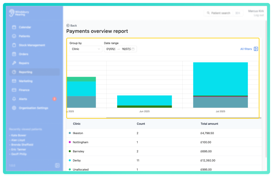
Understanding the table
Directly beneath each chart is a table showing the exact data behind the visuals. This provides full context for analysis and reporting.
Depending on the report, table columns may include:
- The grouping (e.g. Clinic, Appointment Type, Referral Source).
- A count of entries or actions.
- A value (e.g. total revenue, conversions, or refund amount)
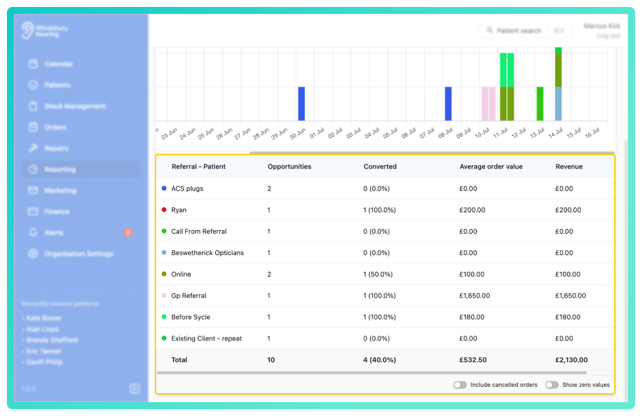
In some reports, additional columns may be included, such as margins or outcomes, depending on what's being measured.
How they work together
- Both the chart and the table respond dynamically to filters and groupings.
- Grouping by different values (e.g. clinic vs by team member) instantly reshapes your view.
- Tables give the details behind the bars, whole charts highlight performance at a glance.
Bar charts and tables together provide a full picture of your data, helping you spot trends, track outcomes, and make informed decisions, fast.
Was this article helpful?
That’s Great!
Thank you for your feedback
Sorry! We couldn't be helpful
Thank you for your feedback
Feedback sent
We appreciate your effort and will try to fix the article